
One of the easiest ways to show the effectiveness of the connected fridge is to develop a monthly infographic. It allows you to communicate on many data that can highlight the importance of installing a digital canteen in your company.
Indeed, an infographic is above all a communication tool that allows you to present a large amount of data in a visual, fun and digestible way.
You can for example:
- Show the advantages that such a solution (connected fridge) offers to employees,
- Present and value the different healthier food choices,
- Offer visibility to your local product suppliers,
- etc.
How to collect data for your monthly infographic?
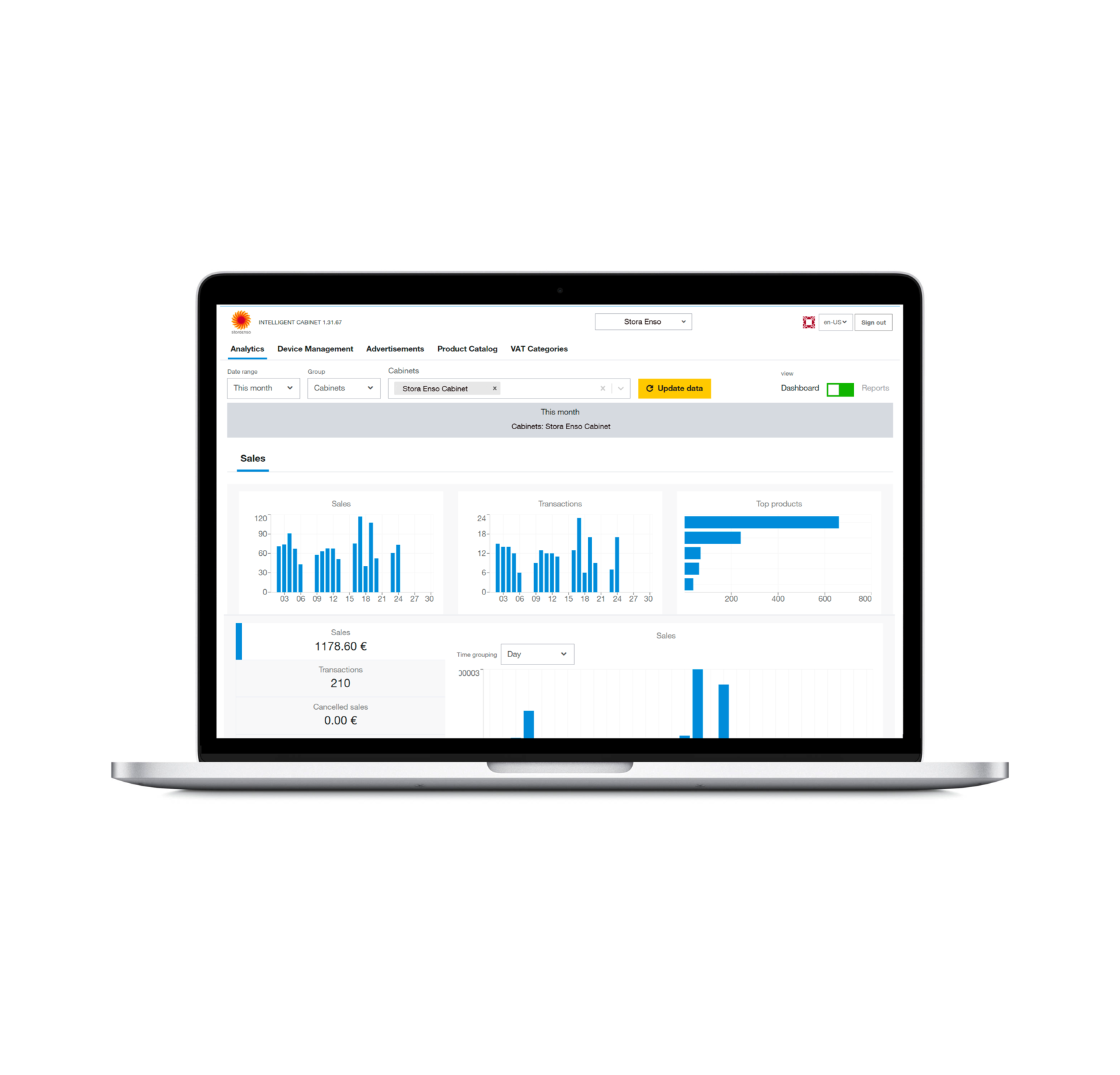
Simply export your data from your back office in CSV format. This export will allow you to view and analyze your sales data.
You can then evaluate the values corresponding to each section of the infographic :
Number of participants : this is the total number of employees who used the connected fridge during the month. Each credit card has a unique identifier that allows you to know how many users have used the digital canteen. You can also develop first and last name combinations to estimate the total number of employees who used the connected fridge.
Favourite products : you can also establish a podium of the most consumed products in the connected fridge and communicate them.
The different local producers involved : you can highlight the local producers from whom you have sourced your different menus. The number of hours saved for employees: this is the most important measure in the infographic. It is about determining the exact amount of time you save the client company with this digital canteen solution. You can get it by multiplying the unique number of transactions by 15 minutes, then dividing it by 60 minutes to get it in hours.
Indeed, using the connected fridge allows the employees of the structure to avoid queuing in the store or in the nearest bakery. They can then spend this saved time to relax or to devote themselves to other activities (sport, meditation...).
For example, if there were 400 transactions for the dish of the day last month, that's a total of 100 hours saved.
400 daily specials x 15 minutes not spent waiting in line at the store/ 60 to get the result in hours = 100 hours of savings in total!
How do you send your infographic?
You have several ways to share your infographic data with your customers.
For example, you can use:
- basic merge and mailing tools,
- more efficient mailing tools such as Hubspot or Mailchimp,
- or simply send by PDF.
In any case, the most important thing is to keep your customers regularly informed of your different activities and commitments.
What to remember
An infographic allows you to highlight all your services and actions. Simple to create, it offers restaurateurs the possibility to communicate monthly on the efficiency of their service.
To learn more about how to create your infographic, contact us!
